

Olive Garden’s Facebook logo update replaces its iconic green-branch emblem with a minimalist ‘OG,’ drawing hundreds of comments and reactions online.
13:25 ET, 07 Apr 2026Updated 10:07 ET, 08 Apr 2026
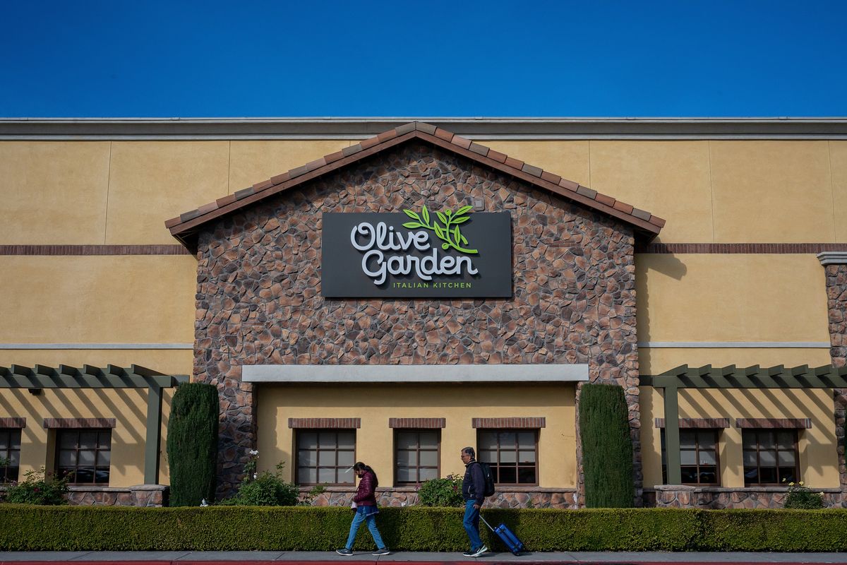
The restaurant chain’s classic logo has been replaced by a sleek new design on Facebook, drawing mixed reviews from Olive Garden fans(Image: Photographer: David Paul Morris/Bloomberg via Getty Images)
Olive Garden, the beloved Italian restaurant chain celebrated for its unlimited garlic breadsticks, nearly ignited a firestorm of outrage after updating its Facebook profile photo.
On March 9, Olive Garden replaced its iconic logo—which features a green olive branch against a brown background—with a more minimalist design displaying its initials (‘OG’) in white on an olive green background, leaving some customers furious in the process.
Although the chain’s previous profile photo had only been on its Facebook page since at least January 2024, the switch generated considerable commentary and divided opinions among Olive Garden devotees. Several users felt passionately about the update, with one urging the brand to “Change it back.”
READ MORE: McDonald’s KPop Demon Hunters collab sparks backlash over bizarre toyREAD MORE: Sit, kneel, and garden without hurting your knees using this handy gardening kneeler and seat
Echoing that sentiment, other Facebook users wrote, “Gross. Minimalism,” and “Another Oversimplified logo.” One user even posted, “Oh hOW BOORIINNGGG.”
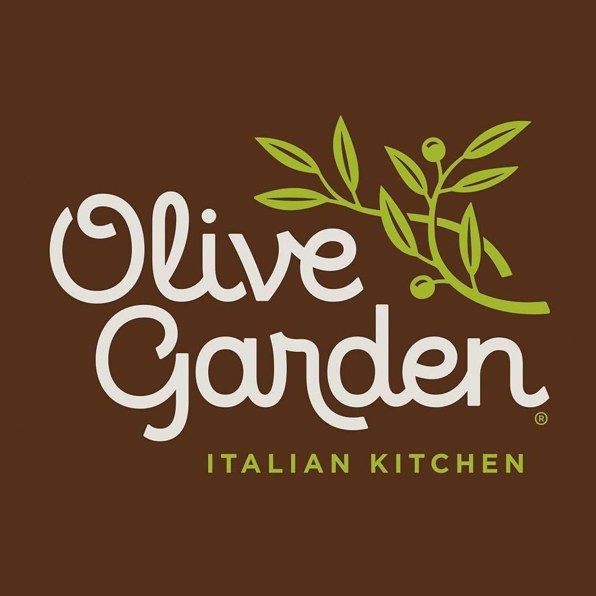
The original Olive Garden Logo spelled out the restaurant name and featured green olive branches(Image: Olive Garden)
Additional customers expressed deeper concern, with one writing, “OH NO THEY WENT BLAND.”
In response to that particular comment, Olive Garden fired back with a witty, “You spelled iconic wrong,” drawing smiley face emoji reactions from fellow Facebook users.
Despite the wave of negative reactions to the restaurant chain’s refreshed profile photo, numerous customers rallied behind Olive Garden’s sleeker new image. All told, the updated minimalist Facebook profile photo attracted over 180 comments and more than 1,200 likes.

The updated Olive Garden logo is much simpler, featuring the restaurant’s initials and sparking backlash(Image: Olive Garden)
Notably, some Facebook users “revealed that they’ve always called the chain ‘OG,'” according to The U.S. Sun.
“I work there and [I] still call it the OG,” one person wrote. “Same logo stitched on my apron (with pride).”
Other comments read, “I’ve called it OG for years!!” and “The undisputed OG.”
One user even cracked a joke about Olive Garden’s revamped profile photo, telling commenters to “calm down” since the restaurant was “rebranding to Original Gangster.”
Rounding out the restaurant chain’s comment section, someone wrote, “Cracker Barrel gonna be mad if this works.”
Comparisons to Cracker Barrel logo backlash
In 2025, Cracker Barrel drew criticism after announcing it would be changing its logo for the first time in 48 years.
Cracker Barrel loyalists swiftly unleashed their fury, with some diners “threatening to never eat there again.” Ultimately, the brand abandoned this move amid intensified backlash and complaints after Cracker Barrel floated the idea of overhauling its Southern country-themed restaurants as part of a $700 million revitalization plan.
Following up on the initial Cracker Barrel comment, one Facebook user stated, “Didn’t Cracker Barrel’s experience with rebranding mean anything to you? Fix the hospitality and value… not the logo.”
Though some users were outraged over Olive Garden’s updated Facebook profile photo, many made lighthearted jokes about the new logo
Inside the design behind Olive Garden’s iconic logo
Despite this recent profile picture update upsetting some devoted fans, this wasn’t the first occasion that Olive Garden switched up fonts and colors.
The current logo—which patrons recognize and appreciate—displays two green olive branches with ‘Olive Garden’ inscribed in a curved white typeface. This has served as the company’s symbol since its streamlined redesign in 2014.
This recognizable design appears at more than 900 Olive Garden establishments throughout the U.S., with states such as Texas, Florida, California and Pennsylvania having the highest number of restaurants.
Comments are closed.