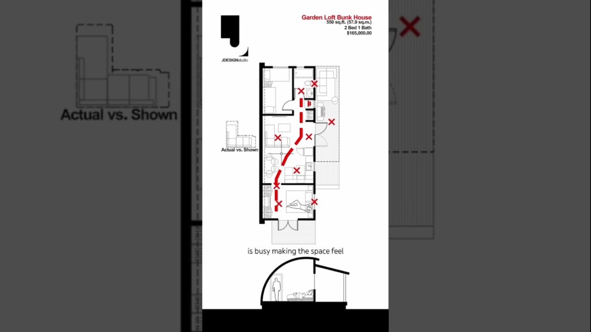
Small space floor plans, tiny home design, and ADU solutions are essential topics in today’s housing crisis. In this video, I review a backyard garden loft floor plan and show how small changes can make the space more functional, less chaotic, and better suited for everyday living. Whether you’re exploring housing solutions, looking for efficient tiny home layouts, or considering an auxiliary dwelling unit to expand livable space, this short highlights practical architecture and design ideas to maximize small footprints.
Garden lot, carriage house, auxiliary dwelling unit, tiny home, housing crisis
#housingcrisis #tinyhome #ADU #floorplans #homedesign #smallspacedesign #architecture #interiordesign
There is a housing crisis in Canada and units like this are needed. But smaller spaces need extra care designing to make them feel as comfortable as possible. So, let’s try and make this 550 ft bunk house feel better. To start, you enter right into the living room with limited storage. When entering, the French doors provide needed light, but without proper planning, the one side is where shoes will clutter and become a tripping hazard. The living room sofa is misleading as it’s scaled down to look normal, but it’s not a standard size. The dining area is cramped, and the kitchen has access issues when the appliance doors are open. The bedroom feels claustrophobic with the tight door against the ceiling and the bed facing the low ceiling. The bed is also exposed to the window behind. The main bath is too far from the master bedroom, and I feel bad for the sounds and smells that’ll be observed from the patio. The patio is obstructed by the door swing, and the barbecue is too close to the seating area. The overall circulation is busy, making the space feel chaotic. To fix this plan, we streamline the circulation and group the public and private spaces together. These two moves add organization and calmness to the space. The patio is easy to access for cooking and entertaining, and an entry bench adds functionality with a place to sit and shoe storage below. It extends into a low entertainment bench that offers additional seating and storage. And the TV can either sit on the bench or get mounted to the wall behind. The kitchen is out of the main path of circulation. The dining table is pulled away from the wall and can double as a prep space and can interact with the living room as additional seating. All furniture now looks out towards the windows and high ceilings, making the spaces feel larger, and a regular size sofa now fits. In the hall, Milwork provides visual separation while adding needed storage for coats, clothes, and a laundry space. While not a formal bedroom, this flex room is great as a home office or sleeping quarters and fits a bunk bed or twin. This design is more of a one-bedroom/studio option. The bathroom is at a private location, maintaining privacy between the bedrooms. And the master bedroom now looks out towards the patio and window while being grounded by the arching roof behind. Did we make this better or worse? Let me know in the comments below.


2 Comments
Much better
Your design is so much better.
The replacement of the doors onto the terrace would make the corridor to the second bedroom/office, and the principle bedroom rather dark.
If the doors were changes to windows it would allow the light into the corridor. The second bedroom could have half glass sliding doors, or transom windows. This would allow natural light into the room, and also air flow. The downside is there would be a loss of a quarter of the storage in the hall.
It's a toss up between light and storage. Some people will prefer the light, others the storage.